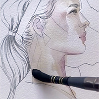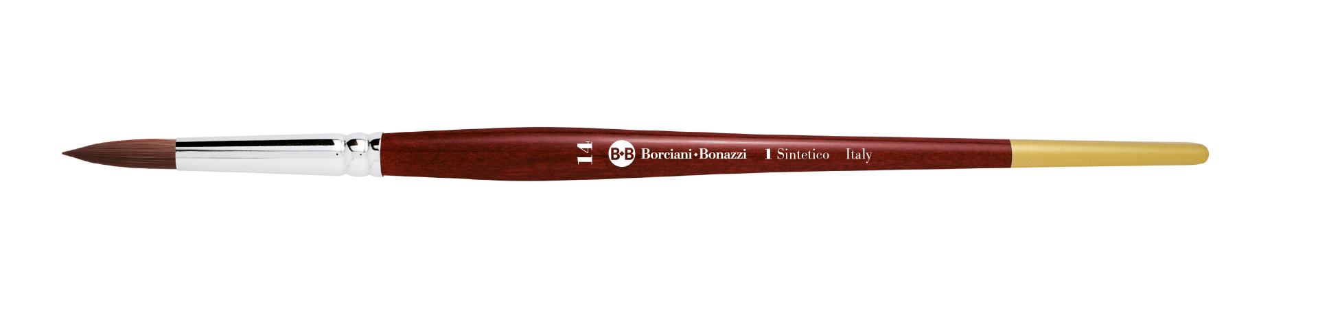

Round tip brush with dark red-violet synthetic fibre, short handle in earth-red lacquered wood and gold tip, with a nickel-plated brass ferrule.
The dark red-violet fibre is tenacious and resistant, being extremely elastic with a good colour retention capacity. Ideal for pasty and dense techniques, such as acrylic... Read more
THE ULTIMATE GUIDE TO LETTERING

The definitive guide to Lettering
Lettering is a word that contains many interpretations within it... let's find out what it is!
Lettering is a widely used decorative technique, many types of brushes are used for this technique, such as:
Lettering is a different technique from Brush Calligraphy and uses different techniques and styles.


What is Lettering?
Lettering refers to a set of letters designed in various styles
Generally it is used to indicate, unlike calligraphy, i.e. manual writing, the study of the shapes in a set of drawn letters, which come from the study of different calligraphic styles, but are "modified" to create a harmonious and balanced composition.
Translating the word LETTERING from English into Italian using a dictionary, the results we will have will be those of "writing", "inscription" and "written", but also of "characters".
All these terms undoubtedly refer to the art of writing, but it is also true that they convey a rather vague concept, also given the difference in meaning between some of them.
In fact, lettering has a much deeper and more complex meaning, as this word defines a real study of letters for the creation of their design, therefore giving an artistic connotation, and not of writing.
Different Lettering styles
Lettering has three main styles: Brush Lettering, Faux Calligraphy and Signi Painting
The different Lettering styles can be divided into macrogroups, identified by the tool used to create it.
Generally, being a personal composition, they are based on the style of the artist who creates them, and they can be multiple. We can divide them into 3 large groups.
Brush Lettering
Brush Lettering – with this term we identify all the styles that are created with brushes or markers with a brush tip.
This is also the name given to various types of calligraphic fonts that share inclinations and proportions, but above all a "modern" and dynamic effect.
This effect is achieved by alternating the use of tip pressure, which creates a large thickness in the descending strokes and a thin one in the ascending strokes, maintaining a strong and expressive gesture.
The use of different brush tips, round or flat, creates further subdivisions, as does the type of color, that can be ink, watercolor, gouache or other. (see paragraph What brushes to use for Lettering).
Faux Calligraphy
Faux Calligraphy or fake calligraphy – with this term we indicate a type of calligraphic fonts that are "drawn" and then filled with color, creating the effect of characters with thicknesses and thin lines, but without the use of pressure.
They can therefore be created either with a brush, with single-line round tip markers, or with other types of means; a perfect example is CHALKBLACKBOARD ART, creative decoration of blackboards, which is made with both chalk and Gesso markers.
Faux Calligraphy is also a great way for calligraphy beginners to create beautiful compositions by “doubling” only the descending lines and filling them with color.
Sign Painting
Sign painting or sign painting - literally the translation from English is "sign painting" and with this term we identify a type of lettering that adds calligraphic fonts transformed in design and shape and mixed with logos, until they themselves become real and own recognizable and very personal logos. An example known to all is the writing COCA COLA, which has become an icon and inspiration in the creation of a real calligraphic font.
This type of "drawn" lettering was created for the creation of signs but is widely used for all decorative applications on different supports. Widely used after the Second World War, mainly with a trend born in the United States, Sign Paint had a large number of established artists in Italy who contributed to creating a trend of the highest quality in the creation of hand-painted signs.
Forgotten with the advent of cutting plotters and digital graphics, it has returned in recent years as a real artistic movement.
To create a Sign Paint we start from an accurate design and composition of colors and fonts to create it completely by hand with pencil, ruler, surveyor's bubble, compass and brushes. The different types of support, from the wall, to wooden panels, to the shop windows, mean that the type of color to be used is also very vast, from synthetic enamels to 23 carat gold leaf, thus also changing the types of brushes to use in the application.
Difference between Lettering and Calligraphy

CALLIGRAPHY, also known as brush calligraphy, the art of writing and writing well, focuses on the study of one font at a time, with well-defined proportion relationships, inclinations and pressures given by the type of character used, and a result of unique and flowing style.
The use of different tools defines the methods and style, and we could talk about it for days to address this vast topic with a long history.
The creation of perfect calligraphic writing requires study and a lot of practice: the fonts are so different from each other that each style will need time to be metabolized in its proportion relationships, in the shape of the letters and empty spaces, and above all in the pressures.
Fine tip nibs, truncated tip nibs, fountain pens of various shapes, monoline tips, round and flat tip brushes, up to the most contemporary and used markers, with brush tip, in felt or silicone, with truncated tip like the Parallel Pen up to the “artisanal” Colapen.
Each of these tools will have its own reference font and a material to be preferred for the best effect, with completely different results from each other.
LETTERING is used to create images with a strong and immediate message! This type of art mixes multiple characters with different proportions and graphics in favor of a harmonious composition and with direct communication of effective phrases, titles or decorative frames in which to insert texts.
It can then be created with various pictorial and decorative techniques to be chosen based on the support on which it is drawn and the desired effect. From the decoration of a shop window and a t-shirt, to a diary page, etc.
Necessary for the creation of balanced lettering are the study of the composition, balance of solids and voids, a good knowledge of various calligraphic fonts and planning down to the smallest details of the combination of color and support.
Used for years especially in CHALK BLACKBOARD ART, i.e. the decoration of blackboards, it has had an immense development in recent years with the spread of handmade techniques that mix different styles:
- JOURNALING, creation of personalized diaries made with mixed decorative techniques of recycling, scrap booking and sewing.
- The BULLET JOURNAL, a personal and motivational agenda that helps you achieve your goals and give order to your days, totally handmade by mixing calligraphic characters, lettering titles and various decoration and painting techniques as desired.
- Dissemination on the web through CALLIGRAPHIC ARTISTS who, with the publication of their splendid works, have pushed thousands of people to constructive imitation and the study of calligraphic fonts with different techniques.
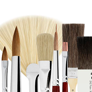
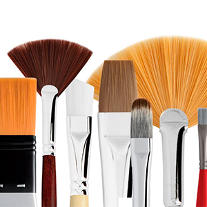
What tools to use for lettering
Lettering can be created with the most varied techniques and, by mixing multiple fonts in the design, even the tools within the same composite image will be different.
A further study, for example in the choice of brushes, is what type of color and on what support we would like to carry out our work.
To choose the best composition tools we will have to understand what type of font to use inside, which we could divide into 3 macro categories:
Fine point font
From the nib to the brush, the basic characteristic of this type of creation is that the tip in use can "open", creating an alternation in the continuous line just by changing the pressure of the instrument on the support.
The descending section, called SHADOW, will be created by pressing the tip, while the ascending section, called LIGHT, will have no pressure and therefore will be thin.
Examples of these fonts are COPPERPLATE, or English Italic, and Modern Calligraphy, a large ensemble of modern calligraphy that brings together many variations.
It is essential that the tip is full of colour, with a large reservoir, and consequently a long stroke that is not interrupted by alternating pressures, at least until the end of the letter.
If in the nib it is the practice that makes the continuous line feasible, in the brush it is the type of hair or synthetic fiber and the length of the tips themselves: ideal are natural hairs such as sable hair, elastic and slow-release of colour, and synthetic fibres. of good elasticity, with long tips for greater stroke length and slow release.
Hollow synthetic fibres, which are created for watercolor and wall painting depending on their diameter, are the most appreciated for the long strokes of these calligraphic styles.
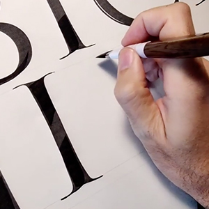
Truncated tip font
For this type of font, flat and rectangular tips are used, which can be used "flat", releasing the color in a wide and regular line, and "edge", i.e. using the thin side to create light ascending lines that are obtained with a change in inclination of the instrument.
Calligraphy was born with this type of instrument, from the art of medieval scribes, from Gothic to Cancelleresca. Almost all capital block fonts are made with truncated tips, starting from Roman Italic onwards.
In the case of these fonts the stroke must be precise and regular, with a defined sign. The nib or the flat tip of the brush must not open, but remain the same size even under pressure: it is therefore ideal to prefer rectangular tips and semi-rigid and precise fibers in the brushes, such as for example the plum synthetic fiber, which has a medium-long stroke but very precise.
With the softer natural fibers and hairs, it will be necessary to develop greater practice in holding the line to avoid "widening" of the line.
Monoline font
Monoline writing, which therefore has no pressure variations in its flow, is created in a thin line in both the ascending and descending strokes. From the pen to the round tip marker, from the fountain pen to the round tip brush, this type of font has the only meaning of having a constant and continuous line, all in LIGHT.
The tools suitable for these fonts have a long barrel and must have a thin and constant tip, which does not open easily.
If this method is simple with the pen, it becomes very important to choose the suitable brush, which must be elastic and rigid, with slow color release with a large reservoir for a long and continuous stroke without variations. Kolinsky sable natural hair used in lightness is ideal for monoline fonts, as well us the brushes in dark-red violet or silver fiber, which hold the line perfectly.
The use of the most suitable sizes appropriate to the desired line thickness is essential, both in choosing round or flat brushes.
Related products
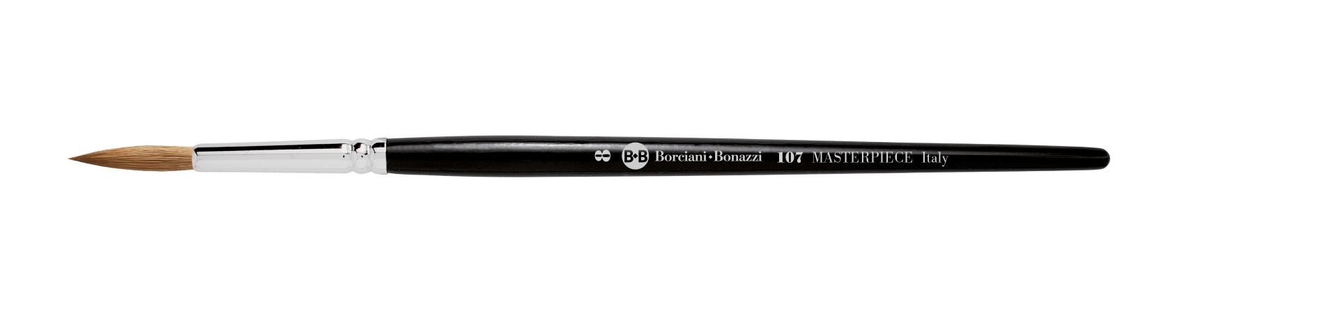
Elongated round tip brush with Kolinsky sable hair, short handle in black lacquered wood and nickel-plated brass ferrule.
The precious Kolinsky sable hair is ideal for watercolours and extremely diluted techniques such as oil glazes and gouache. The longer hair means extreme colour absorbency with a slow and... Read more
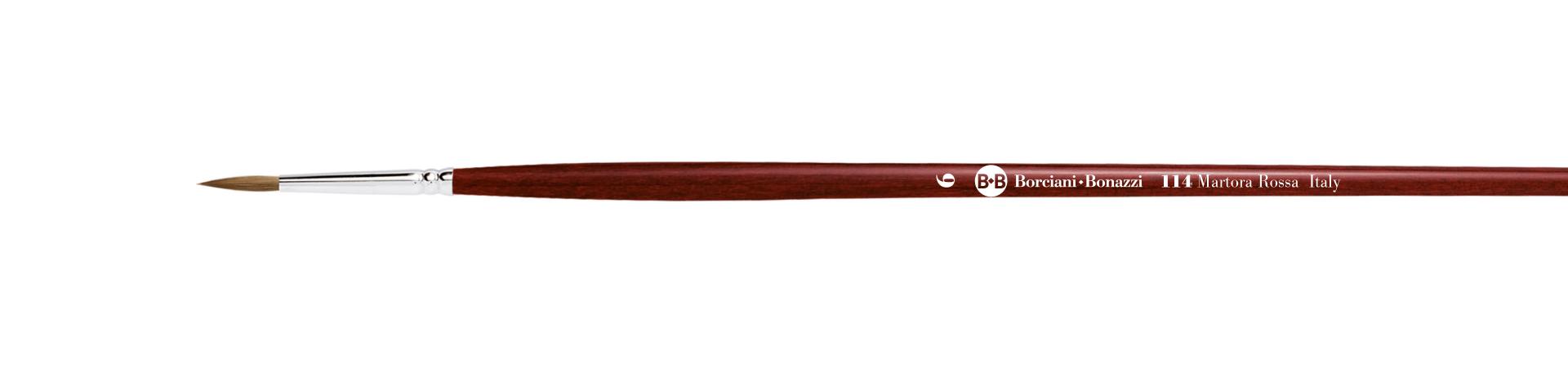
Series 114 round brush with red sable hair and long handle.
€10.80
(VAT incl.)
Elongated round tip brush with red sable hair, long handle in earth-red lacquered wood with gold tip and nickel-plated brass ferrule.
Red sable hair has the same features of Kolinsky sable hair, even if less valuable, including excellent absorbency and the slow and homogeneous release of fluid colours. It is ideal... Read more